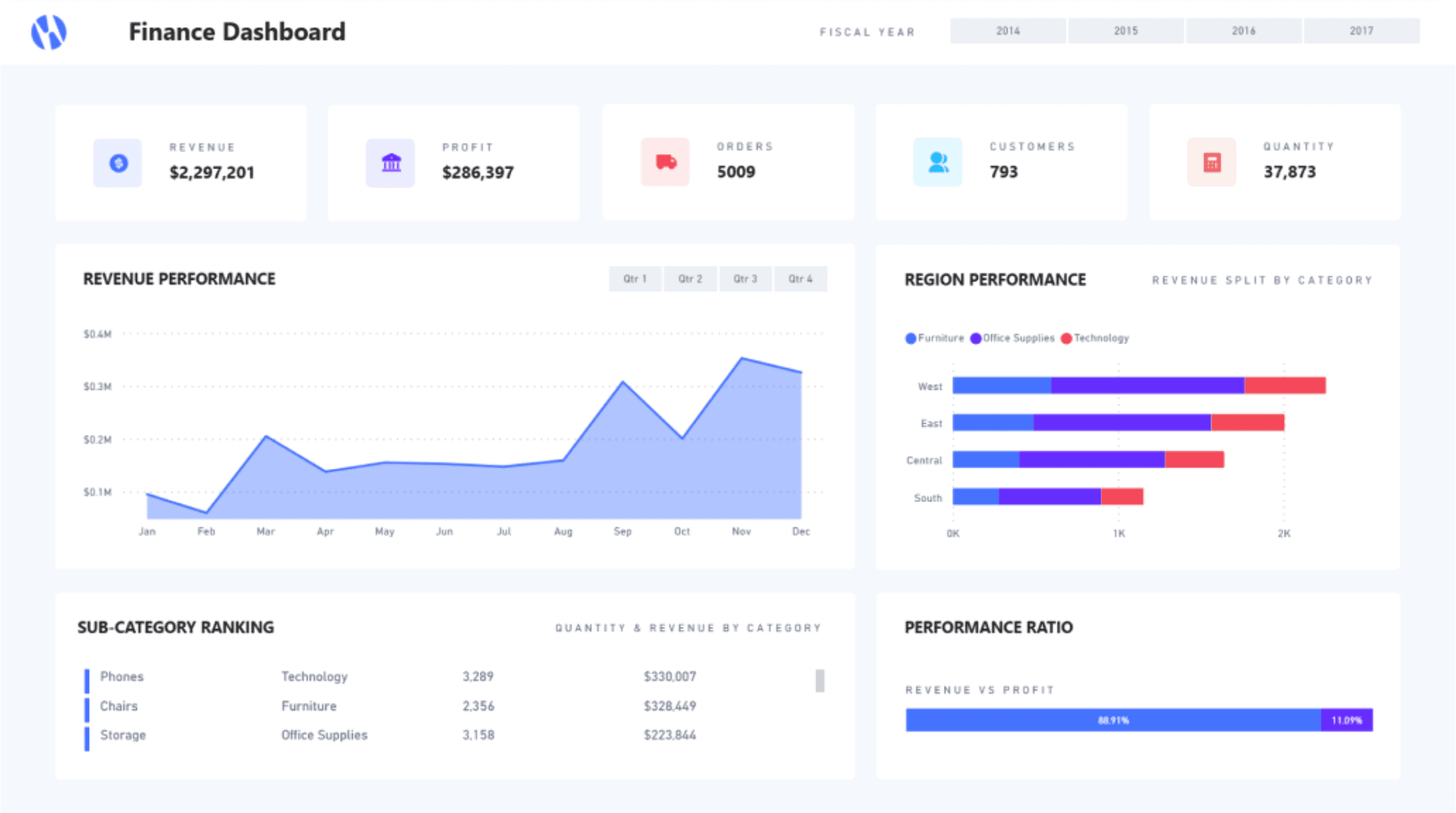
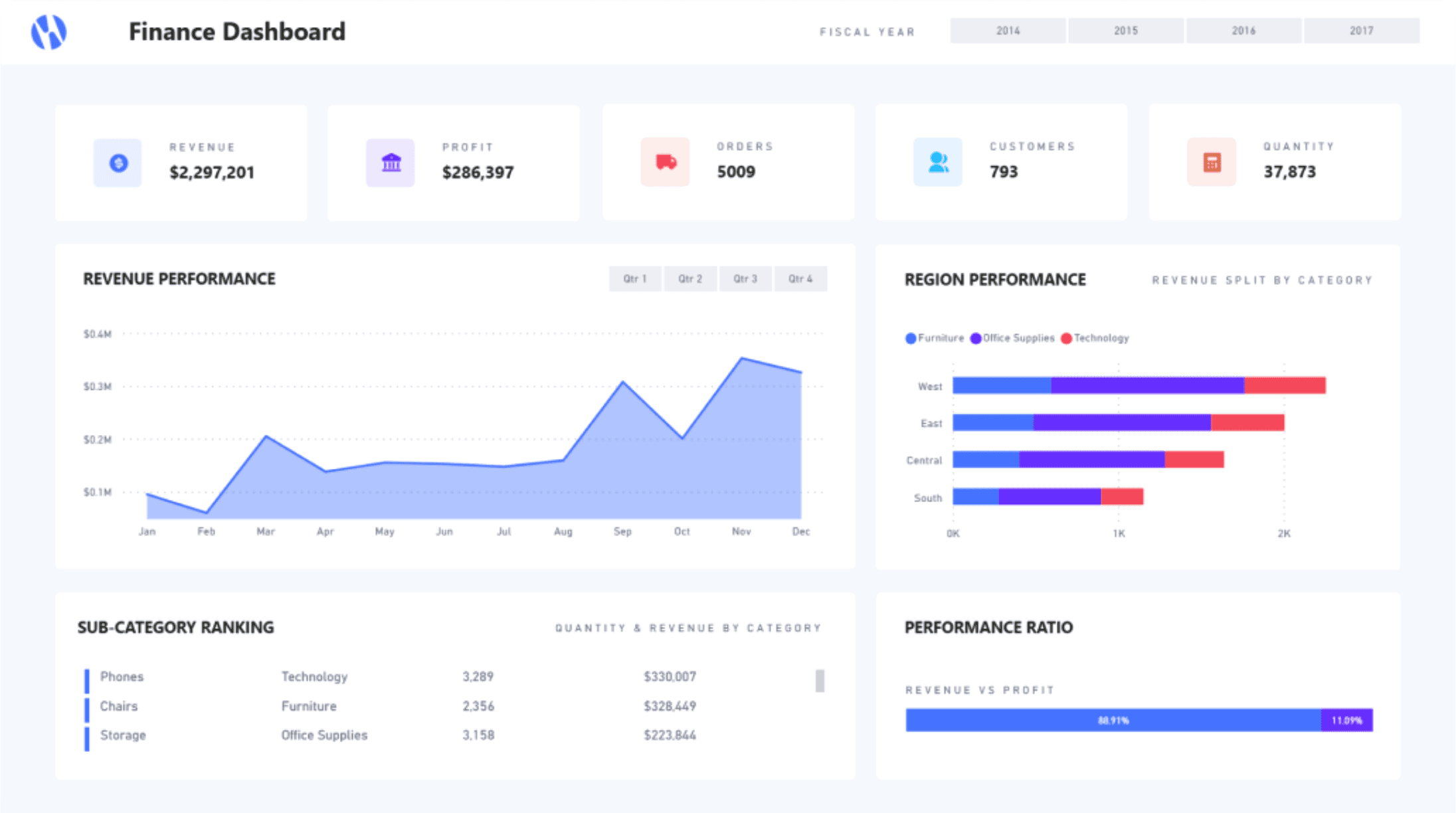
What ?
A professional training program co-designed and delivered for IT and business teams involved in Business Intelligence and dashboard projects. 3 modules, 66 slides, hands-on exercises based on real-world cases.
Why ?
Dashboards are too often designed by people who master the data but not the user experience. The result: overloaded, hard-to-read interfaces that fail to serve analytical goals. This training was born from that observation — giving data teams a shared vocabulary and a method so design enters projects early, before the wrong decisions get locked in.
How?
Three progressive modules:
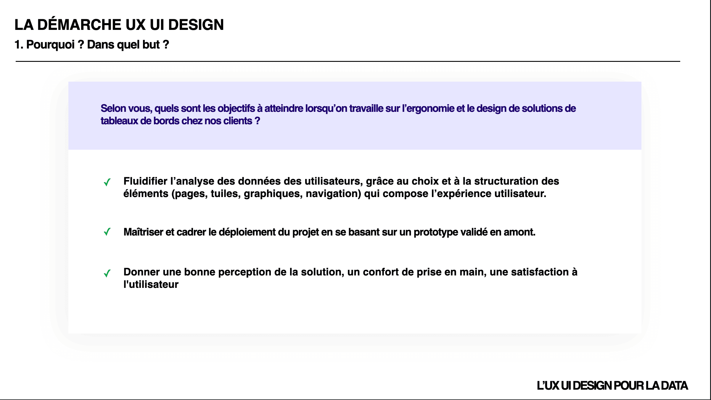
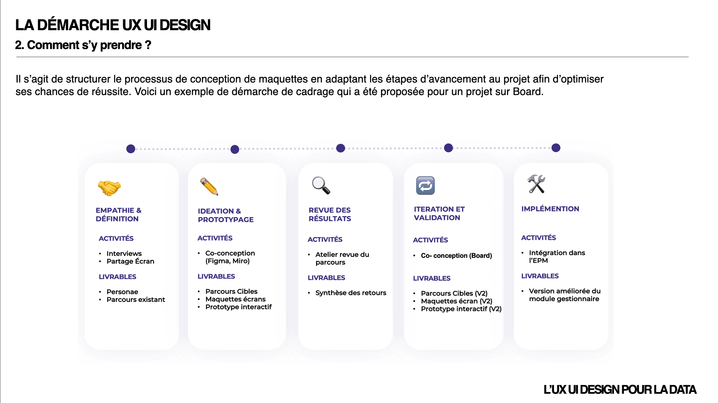
UX approach — scoping, user research, prioritization
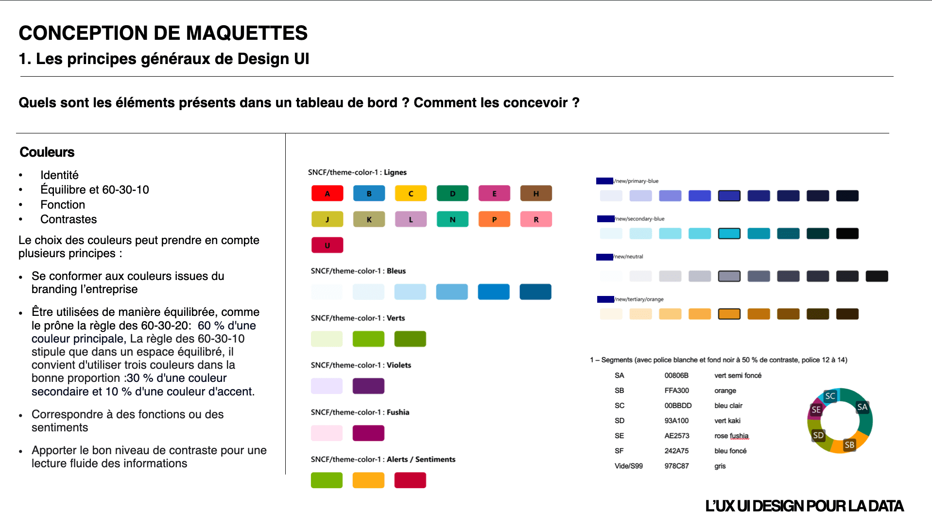
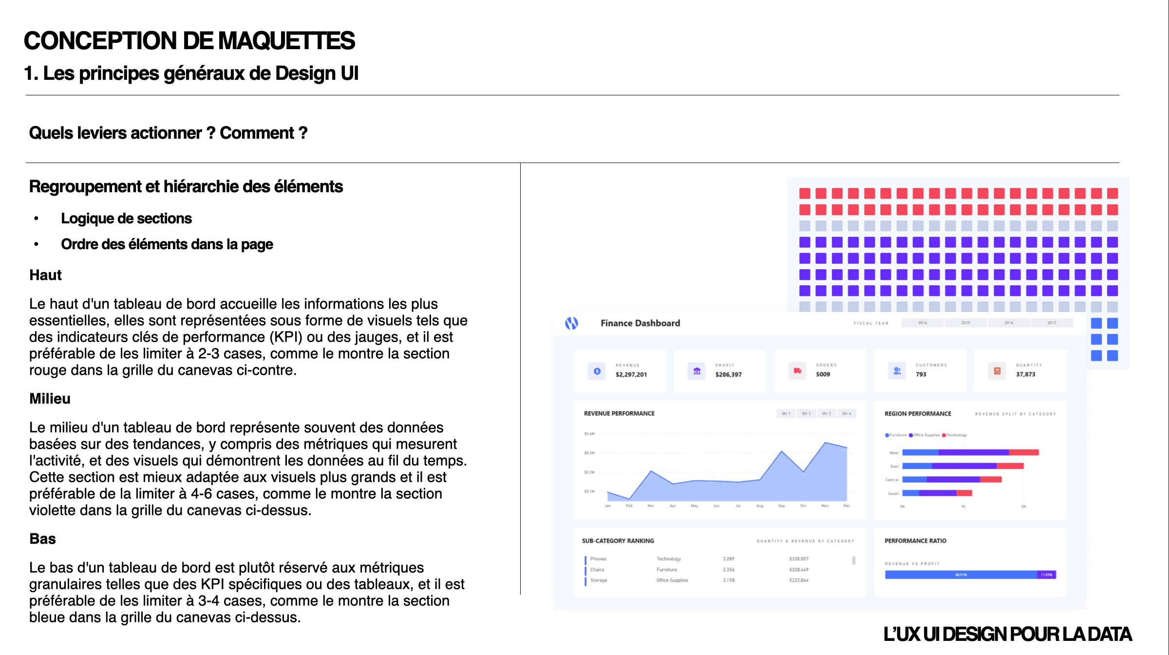
Wireframing & mockups — UI principles, dashboard usability, chart selection, design systems
Power BI integration — themes, JSON customization, best practices
All punctuated by exercises based on real-world cases: identifying usability issues, co-designing solutions, and balancing readability against information density.
Outcome
Data teams now equipped to embed a UX approach into their BI projects — from the scoping phase through to delivering a usable, readable dashboard.